In the fast-paced world of digital marketing, where online presence is paramount, the importance of a visually appealing and recognizable brand cannot be overstated. Logo design, once a static element, has undergone a significant transformation, adapting to the demands of the digital landscape. To be competitive online, small businesses should reevaluate and update their branding strategies, with a particular emphasis on creating a distinctive brand mark for enhanced online visibility.

The Shift to Digital
Digital marketing has revolutionized the way businesses connect with their audience. As online platforms become primary arenas for brand promotion, logos play a crucial role in establishing a memorable visual identity. Unlike traditional marketing channels, the digital realm demands adaptability and scalability in design to ensure that logos remain effective across various devices and screen sizes.
Simplification for Recognition
In the age of digital information overload, simplicity is key. Logos are now designed with a minimalist approach, focusing on clean lines and easily recognizable symbols. This simplicity aids in quick recognition, essential for capturing the fleeting attention spans of online audiences. Small businesses, in particular, benefit from this trend, as a straightforward brandmark is more likely to be remembered and associated with their products or services.
Enhanced Storytelling through Imagery
Digital marketing encourages brands to tell their stories visually. Logos have evolved to incorporate meaningful imagery that communicates the brand’s values, personality or unique selling propositions. This storytelling aspect helps small businesses forge a stronger emotional connection with their target audience, fostering brand loyalty. Often, small businesses try to copy their competitors when it comes to logo design. The best way to tell YOUR brand story is to create a unique design that is unmistakably YOU.
Below are a few companies who have successfully rebranded to adapt to the digital landscape.



Mailchimp
The original Mailchimp logo served its purpose at the time introducing a friendly mascot, Freddie the chimp, making the brand more approachable and memorable in a technology space that was lacking in personality. As the brand grew to offer more than just email services, their story and their logo needed an update. Keeping the recognizable Freddie icon, the logo was simplified with a stylized graphic and bolder, more legible font that is still playful enough to remind consumers that Mailchimp is user-friendly.

Instagram
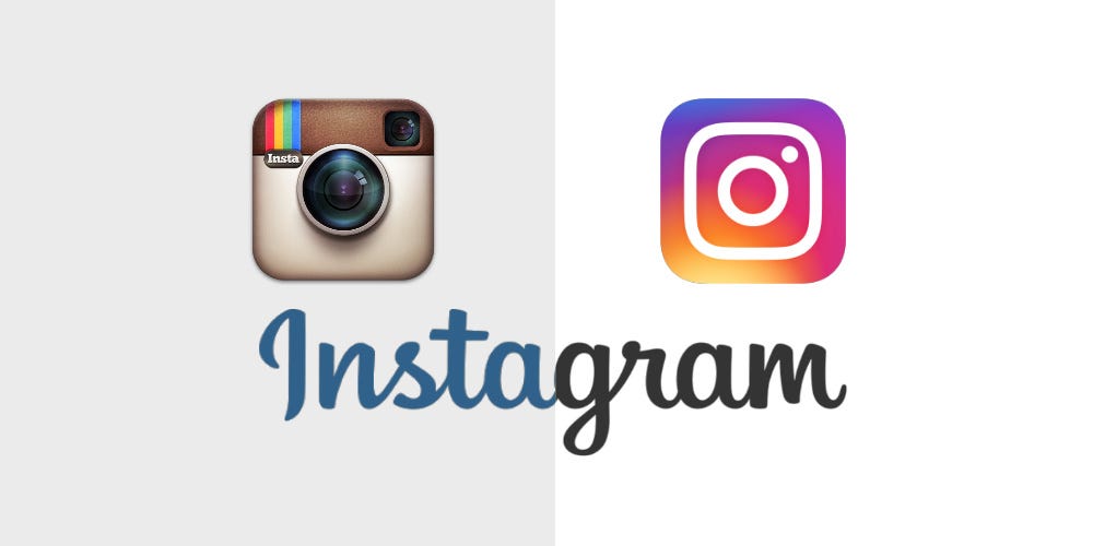
Originally created and known for its photo filters, Instagram’s logo took on the retro look of a polaroid camera. The updated logo features a simplified camera icon, aligning with contemporary design trends and emphasizing the platform’s evolution beyond just photos.

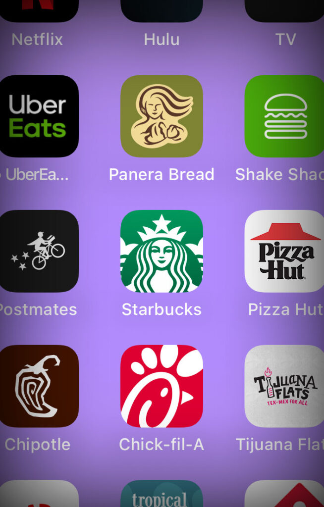

Starbucks
The evolution of the Starbucks is great representation of changing with business growth and technology. The original coffee-colored logo was probably just fine for the small-town window signage, but once the company expanded, the brand needed national recognition. Kelly green became the new pop of color, and a simplified mermaid icon took center stage. That clean and clear logo was so strong that the latest rendition needed no words. It is now recognizable on its own, alongside McDonald’s “M” and Nike’s swoosh.
The evolution of logo design in response to the demands of digital marketing underscores the need for small businesses to prioritize their online visual identity. By embracing the trends of simplicity, adaptability, and storytelling through brand marks, small businesses can position themselves for success in an increasingly competitive online landscape. Revisiting and updating a brand’s logo is not just a design choice; it’s a strategic move to stay relevant and resonate with the ever-evolving digital audience.
How’s your logo holding up? If you need help revamping your brand and competing in the digital scene, just look for the water tower in the sky.


